Understanding
During the first kick-off meeting, we identified that our client is looking to redesign his current website which is compatible with desktop, mobile, and tablet. (www.mysevenchakras.com ).
Usability Heuristic Evaluation
Our team tested the current website design usability through set of parameters given by NN Group.Some of the primary usability issues we discovered -
Business Goals
1. Increase email-subscription and decrease the bouncing rate.
2. Redesigning visual design through the brand style guide.
3. Creating a trustworthy and authentic experience for end-user.

Defining Problem & project scope
Usability testing of a current website provided us with a brief overview of design challenges ( UX + Visual design ) that we need to overcome -
1. Establishing user-centered design techniques such as research, planning, usability testing & prototyping
2. Auditing website content to reduce cognitive load.
3. Redefining information architecture for the whole website
4. Redesigning visual design of a current website ( landing, podcasts and contact page )
Research
Google Analytics
To understand more about the incoming audience traffic and user behavior while using the website, we looked at the analytics data to find a pattern and discovered the following insights -
1. Our primary target audience visiting a website are women ( 23-35 years of age )
2. Average session duration between the pages ( 0 - 10 seconds )
3. An average bounce rate of a website is 77.74 %4. A user visiting websites, most likely to visit other websites related to (Food & dining/cooking enthusiasts/30 minute chefs) or value shopping sites.
Survey Findings
Planning
Interview Findings
We’ve interviewed in a total of 5 female participants from states who are a pretty regular listener of podcasts. All the interviews were conducted over zoom call as they were not present in the city. Through the interview findings, we were able to formulate our research findings into our primary persona.
Customer Journey Mapping
We've mapped out the journey of Kate from discovering the podcast to subscribing to a private coaching program.
This helped us to discover the area of pain-points that Megan is facing in every stage and simultaneously discussing potential opportunities to overcome these pain-points.
Areas of opportunities disocvered :
1. Reframing information architecture for navigation and landing page.
2. Adding a search bar to search for different episodes.
3. Podcast categories to filter option to view guest interviews.
4. Auditing content for about seven chakras and host page.
Information Architecture
While performing usability heuristic analysis on the current platform, we discovered a lot of usability issues and bad information architecture leading user to leave the platform :
Redesigning Navigation :
Content hierarchy of current navigation pages is not prioritized according to user goals -

Design
We started our design exploration with low-fidelity wireframes to structure the visual hierarch and information architecture.

After establishing the visual hierarchy, we’ve converted low-fidelity wireframes into mid-fidelity with real content to test our early concepts with end-users.

Testing
We conducted testing with 5 users and some of the usability issues that we discovered -
1. Discovering episode details on a landing page
2. Pagination on podcast page
The presence of more than 500 episodes on the podcasts page makes difficult for users to navigate because he has to click several times to reach that particular episode page. Our proposed design pattern was to allow a user to input the specific pages that they want to visit. While providing the default option of next and previous.

High-Fidelity Design
Podcast Page Navigation ( Final-Iteration)
1. Prioritizing search bard over podcast picture
2. Users can select multiple categories of podcasts at the same page
Episode Page ( Final- Iteration)
1.Keeping the search bar in the episode page
2. adding episode details such as released time, time, amount of views
3. providing similar episode suggestions below
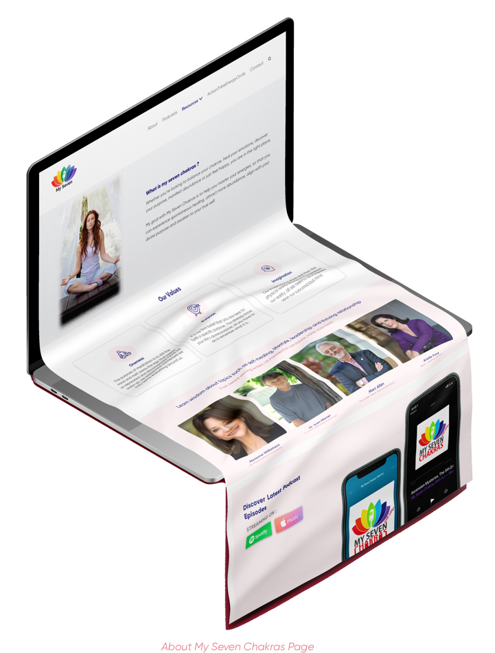
About My Seven Chakras Page ( Final - Iteration)
Future Considerations
1. Adding a login feature for users, so that they can create and save their custom playlist in the future.
2. Create a separate marketing page to attract potential sponsorship and collaboration with a brand
Impact :
1. Decrease boucing rate of whole website by 45%